A look ‘behind the scenes’ at the logo design process.
So you know I like to use the term holistic, when discussing online business building and growth, right? This is because there are so many individual parts that really need to work together, to get your business’ online presence right and start attracting your ideal audience. Imagine that your business is a house. . . Branding is the “look” of the house- paint colors, textures, architectural style, interior design, etc. The logo of your business would be like the door of your house. A logo isn’t synonymous with branding, it’s only one piece, but it’s the first thing most people see and it ‘opens the door’ to your brand.
In another post, I’ll go into more detail about other branding concepts and elements, but in this post I’m just focusing on the process of creating a logo. It can seem pretty mysterious to people who haven’t been in the process before, but as you can see in the above graphic, there are many steps involved! And it’s so important. A logo can really make or break your brand- think of how iconic some logos are, like Nike, Apple or Starbucks. This is why logos can sometimes cost tens of thousands of dollars!! (True story: I know one local design firm that charged $38K for a logo!). Still, I get emails frequently from potential clients who “just want a simple logo”, which is understandable- after all, it is just one little graphic with some text, right? Well, the short answer is no.
Here are the steps typically taken when I create a logo for a client:
1. Holistic Consultation:
The client & I have a discussion to get clear on their ideal audience (client/ customer), the brand’s identity and values, and how that aligns with the client’s business goals.
2. Inspiration:
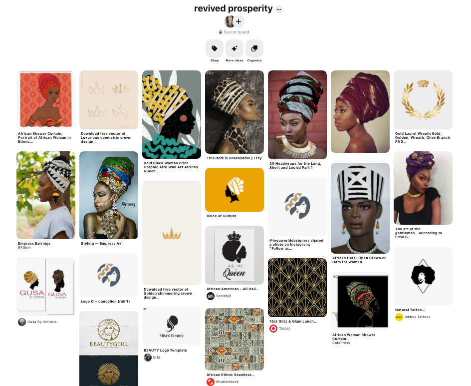
Generally a Pinterest board that we can both add to, or a collection of images in a folder that the client provides.
Here is an image of the Pinterest board I created for a logo I recently created for Lee & Brianna of Revived Prosperity:
3. Round 1 of Sketches:
Multiple concepts/ ideas of logo will be submitted for client to choose from (in black & white)
4. Feedback:
Client will pick 1-3 concepts from initial round of sketches.
Feedback needs to take into account 2 things:
1. Concept– Does the overall concept of this logo fit with the brand’s message?
2. Design– Does the “look” of the logo fit with the brand’s aesthetic and will it appeal to the ideal audience? Later in the design process, feedback will focus on specific elements like font, color, line, etc. How do each of these elements individually (and collectively) express the brand’s message?
5. Round 2 & 3 of Rough Logo Designs (and more feedback):
I continue working in b&w until we hone in on the basic design.
Here are just some of the sketches I sent Brianna & Lee, based on our initial consultation, the inspiration they sent me as well as feedback:
![]()
6. Color & Font Selection:
I add color to the “final” logo design(s) and give the client at least 2-5 font choices.
Here are some of the color versions I sent Brianna & Lee, once we agreed on colors (from the Pan-African flag) and narrowed down our choice of sketches.
![]()
7. Final files submitted:
Generally there are at least 8 versions of the logo given to the client (b&w and color, jpg & png files), sometimes more.
Here are the final versions of the Revived Prosperity logo, in b&w and color:
![]()
8. Branding Guidelines Document:
This explains use of color, color codes, fonts used, brand identity, etc. (helpful when moving on to web design, creating marketing materials, etc.)
If I am coaching a client, or building a website and/ or marketing plan for them, the logo is where I start, followed by the rest of their branding. Getting all of these elements in alignment is key to having a successful brand, but the logo is the linchpin of it all!